St. John Lutheran
Church & School
St. John Lutheran Church and School is a multigenerational faith community that embraces both its German Lutheran roots and its commitment to caring for local families. The K-8 school and early childhood program are integral ministries of the church and core to the church’s identity. Leaders sought an update to the church’s identity to bring greater clarity and alignment with St. John’s mission and values and build stronger unity and recognition.


Foundation
Our work with St. John Lutheran started by bringing their newly established core values to life with tangible brand traits. These traits informed the design of the identity system, including key messaging.


One for All
and All for One
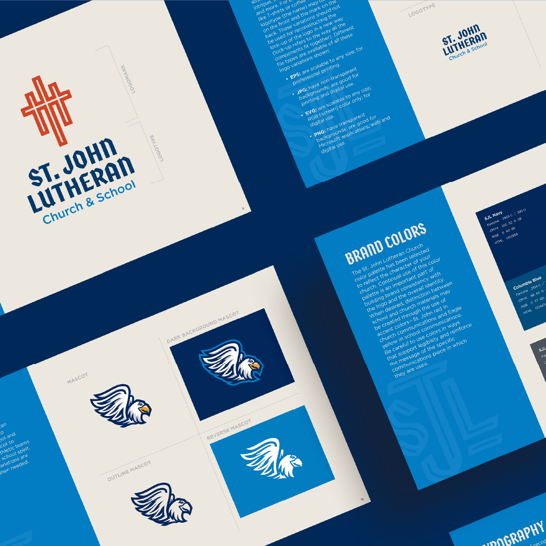
New leadership at St. John Lutheran wanted their identity to more directly express the centrality of Christian theology to their organization’s mission. The identity also needed a unique balance of flexibility and consistency to represent the church, school, and childcare program as interconnected yet distinct organizations. The three interconnected crosses in the primary logo reference both the theological concept of the trinity and the three entities that make up St. John Lutheran.
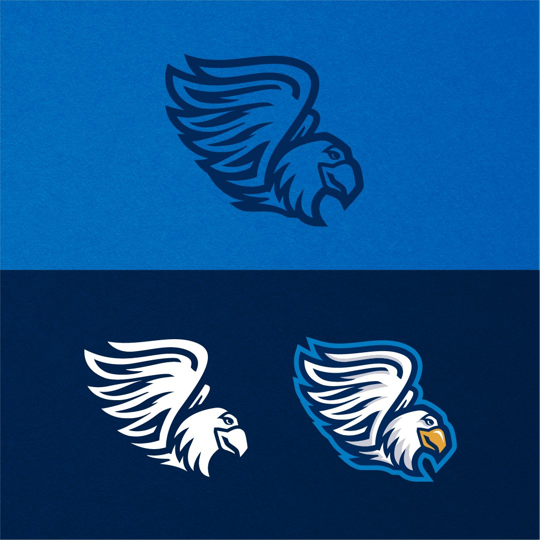
The school’s Eagle mascot was a well-loved component of the old identity but needed updating to be consistent with the new identity. In this new update, I created a thorough set of versions that enable the mascot to be used for a wider range of applications and contexts.

Application: Past, Present, and Future
The creation of St. John Lutheran’s new brand identity coincided with the church’s 170th anniversary and the development of a new website. This presented opportunities to help St. John honor its heritage across both print and digital media as well as with unique applications like Oktoberfest drink coasters.


An Identity System with Warmth and Roots
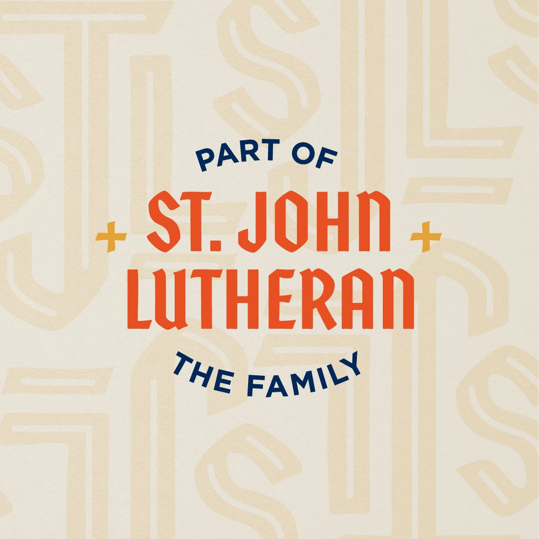
To build off of the existing brand recognition St. John Lutheran already had with its audiences, I used the previous visual system as a foundation for the new one. Red and yellow were added to the color palette to add warmth and variation; these colors also provided a way for St. John to distinguish church communications (designated with red) from school communications (designated with yellow). The blackletter typeface, Cinder, creates distinctive headlines that harken back to the church’s German roots. Additional visual iconography in the form of patterns, a monogram, a badge, and illustrations of the church’s architectural feature’s create an expansive visual system that equip St. John to share its mission with a wider range of expression well into the future.